Chart Design + Process
The case:
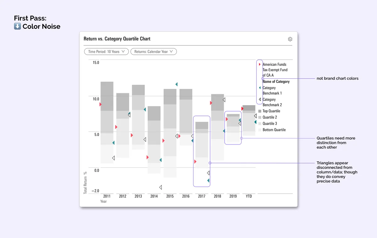
When modernizing this legacy chart, my team and I realized we couldn’t simply upgrade it to our current design system. It wasn’t a part of our library of chart tech, and we needed a more clear way to show comparative data that relied on more than our system chart colors.
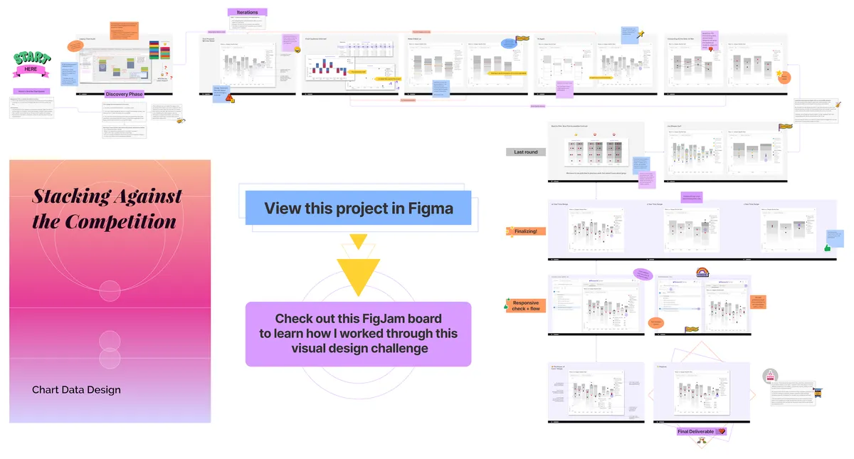 Want to learn more about this project, and see my process? View my FigJam Board presentation on Figma!
The role:
As the visual designer, I created a solution that both solved for showing all the data required at the same time; and a way to keep the many elements from competing for user attention.
This work involved collaborating with engineers to be sure the integrity of the data was preserved, and was translated for folks who are not mathematically-focused.
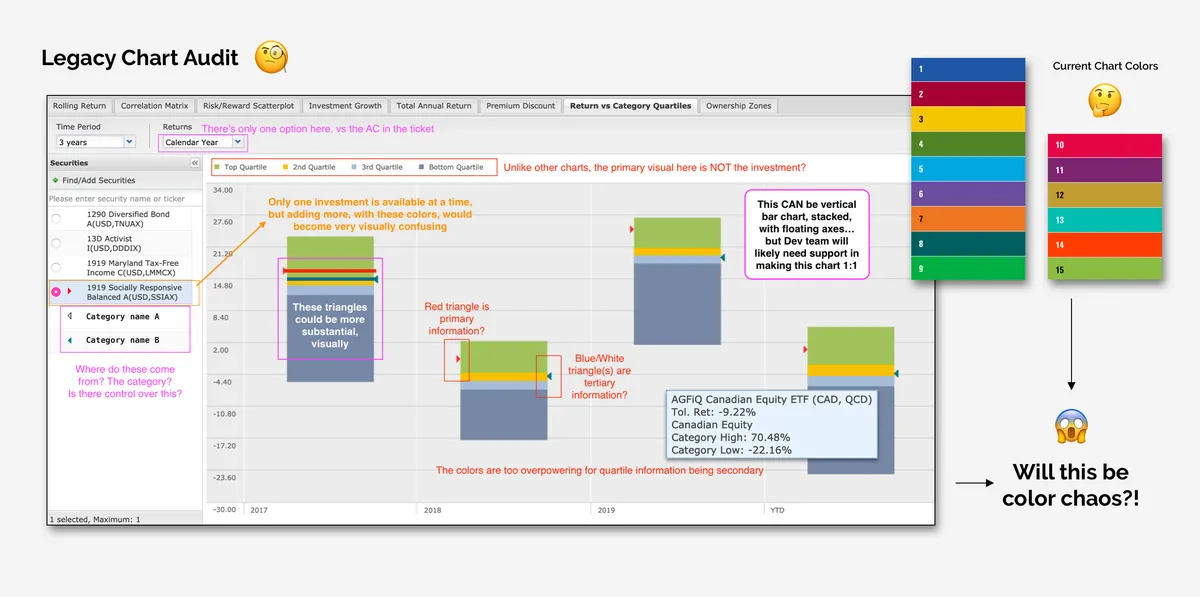
The solve:
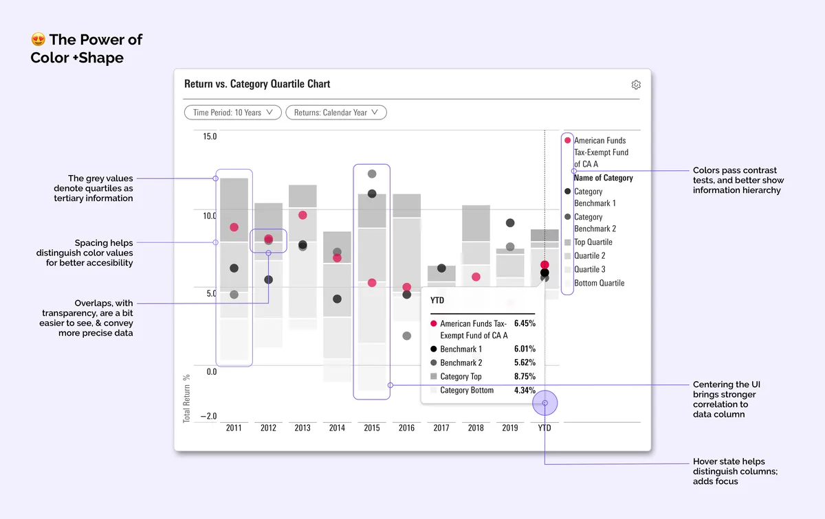
The way I differentiated competing visual data was to employ the use of a variety shapes, tints, and line textures to increase accessibility. We focused the primary data with one saturated color, and the comparative data with shades of grey.
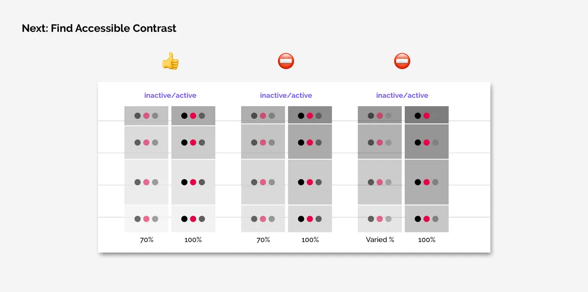
To help distinguish the greys, we employed white space to create bands in our stacked bars. This, in addition to opacity shifts, helped our users understand which data visual to look at first, and compare it.